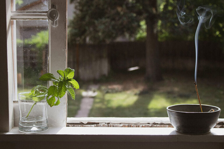
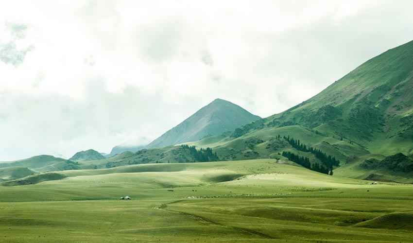
There’s something undeniably captivating about the colour light green that resonates deeply within me. Every time I step into a room adorned with walls painted in this refreshing hue, an overwhelming sense of calm washes over me. It’s as if the very atmosphere is infused with tranquillity, allowing all my worries to dissipate like mist under the morning sun. Perhaps my affinity for this colour can be traced back to my teenage years, when the green blades of grass beneath my feet became a canvas for endless afternoons of football. Those vibrant fields held not just the thrill of the game, but also the joy of camaraderie and the freedom of youth, a beautiful juxtaposition within that soft green backdrop.
But beyond personal nostalgia, the impact of colour on our emotions is a fascinating exploration worthy of discussion. Colours wield a profound influence on human psychology, serving as triggers for various feelings and moods. Each hue seems to communicate a different message, crafting an invisible dialogue between our surroundings and our emotional states. Today, let’s embark on an enthralling trip to delve into the intricate psychological effects that colours hold over us. Together, we will uncover how these vibrant tones can shape our experiences, impact our decisions, and enhance our overall well-being.
Harnessing Hues to Enhance Mood & Mental Wellness
Colours extend far beyond their visual appeal; they have an extraordinary ability to shape our emotions, influence our behaviours, and affect our mental health. Each hue serves as a silent language, communicating feelings and attitudes that affect us on both conscious and subconscious levels. For instance, soothing greens often populate therapy rooms where healing takes place, while vibrant reds energise workout environments, pushing us to exceed our limits. Studying the intricate world of colour psychology reveals that different shades can elicit unique physiological and emotional reactions, significantly impacting our overall well-being. This article will take an in-depth look at the fascinating science behind colour perception, its cultural significance across societies, and its therapeutic applications in fostering emotional resilience and mental health.
We will explore groundbreaking research that elucidates the connections between colour and mood, highlighting how specific colours can help alleviate anxiety, enhance productivity, and inspire creativity. By examining cultural variations in colour associations, we’ll uncover how geographical and social factors play a role in our emotional responses to colour. Moreover, we will discuss practical strategies for incorporating the intentional use of colour into daily life and therapeutic settings to create environments that promote well-being. From reimagining your workspace to curating soothing home environments, the power of colour can be harnessed to enhance mental health, cultivate a sense of peace, and empower emotional strength.
The Psychological Influence of Colour on Mood & Mental Health
Colours are more than mere visual stimuli; they are powerful emotional catalysts that shape our moods and mental well-being in profound ways. Each hue possesses a unique ability to evoke a spectrum of physiological reactions and emotional responses, which can significantly influence our daily experiences, behaviours, and overall mental health. Warm colours such as the fiery red, the sunny yellow and the lively orange, are often infused with energy and exuberance. These vibrant shades can uplift our spirits and instill a sense of happiness and enthusiasm. Yet, their intensity can also tip the scales into the field of heightened emotions, leading to feelings of anger or hostility in certain contexts. For instance, a room swathed in bright red may feel exciting during a celebration, but the same colour can create an overwhelming atmosphere if overused or presented in a jarring manner.
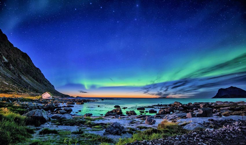
In contrast, cooler colours, such as tranquil blue, refreshing green, and serene purple, are typically associated with calmness and peace. Blue, renowned for its soothing qualities, is tied to trust and serenity, making it a favoured choice in therapeutic spaces and workplaces striving for an air of reliability. Green symbolises balance and growth, often employed in areas designed to alleviate stress and foster a sense of well-being. Purple, the hue of creativity and spirituality, invites introspection while enriching our emotional landscapes. However, it is essential to understand that the psychological effects of colour are deeply subjective. They are coloured by individual experiences and cultural contexts. A striking example is the colour red: while it may embody passion and love in Western traditions, in Chinese culture, it signifies good fortune. Similarly, while white may stand for purity in some societies, it conveys mourning in others. Such cultural nuances play a pivotal role in shaping how we perceive and emotionally respond to colours.
Scientific research substantiates the notion that colour can evoke physiological changes. For example, exposure to red has been shown to increase heart rate and adrenaline levels, while blue and green tones are linked to lowered blood pressure and enhanced relaxation. These phenomena have led to the rise of practices like *chromotherapy, where specific colours are used intentionally to address emotional and physical health concerns. However, while the implications of colour therapy are exciting, the scientific validation of these practices remains in a nascent stage, requiring further inquiry to clarify the influences of culture, context, and personal perception.
*Chromotherapy: Rooted in ancient healing practices, this therapy posits that different colours correspond to specific energy wavelengths, each possessing unique properties that can influence our mood and well-being. By incorporating colours into environments or treatments, practitioners aim to restore balance and harmony within the body, encouraging the natural healing processes to flourish. Whether through painted spaces, coloured light therapy, or fashion choices, Chromotherapy invites us to reconnect with the profound impact of colour on our daily lives, urging us to appreciate the subtle interplay between our surroundings and our health.
In conclusion, the profound effects of colours on our mood and mental health are a fascinating interplay of emotional symbolism, subjective experiences, and cultural interpretations. By harnessing the psychological power of colour, we can design environments, be it in our homes, workplaces or therapeutic settings, that cultivate emotional balance and mental well-being. Understanding and leveraging these vivid psychological connections not only enhances our appreciation of colours but also empowers us to create more uplifting spaces for ourselves and others.
The Chromatic Connection – How Colours Shape Our Emotional Landscape
Looking closer at the fascinating interplay between colour and emotional well-being unveils a vibrant tapestry of scientific insights that reveal how our surroundings can profoundly influence our feelings and behaviours. Research demonstrates that various colours engage distinct physiological and psychological responses within us, acting as silent yet powerful forces that can uplift or diminish our mood. Take, for instance, the colour red. This bold hue is often associated with heightened arousal; it can elevate heart rates and even ignite aggressive responses in certain contexts. On the flip side, the serene hue of blue casts a calming spell, fostering relaxation, serenity, and a sense of trustworthiness. Such dichotomies in emotional response underline the importance of colour in both our personal and communal spaces.
Historically, theories surrounding colour’s emotional impact have deep roots. The renowned German writer *Johann Wolfgang von Goethe posited that colours stir strong emotional reactions, establishing a foundational understanding of this phenomenon. Pioneering empirical studies, such as those conducted by psychologist *Max Wertheimer, explored bodily reactions to colour stimuli, paving the way for contemporary investigations that utilise advanced technology like electrocardiograms and brain imaging. These modern tools enable researchers to quantitatively assess the intricate ways colours can affect autonomic functions and neural pathways, revealing just how intertwined our emotional health is with our visual experiences.
*Johann Wolfgang von Goethe: A towering figure of German literature and intellect, cast a profound shadow across the cultural landscape of the late 18th and early 19th centuries. His works, from the seminal play “Faust” to the lyrical poetry of “West-östlicher Divan,” delve into the intricacies of the human experience, exploring themes of love, ambition, and the eternal quest for meaning. Goethe’s mastery of language and his innovative blending of poetry and prose reflect not only his deep philosophical insights but also his belief in the transformative power of art. As a key figure of the Sturm und Drang movement and a precursor to Romanticism, Goethe’s influence extends beyond literature; he was also a pioneering scientist and a statesman, embodying the ideal of the Renaissance man. His profound understanding of nature and the human condition continues to inspire generations, making him an enduring emblem of creativity and intellectual exploration.
* Max Wertheimer: A pioneering figure in the field of psychology, best known as one of the founders of Gestalt psychology, a revolutionary movement that emerged in the early 20th century. His innovative theories challenged the reductionist views of behaviourism and structuralism, emphasising the importance of holistic perception in understanding human experience. Wertheimer’s concept of “gestalt,” which means “shape” or “form” in German, underscored that the mind organises sensory input into meaningful wholes, a principle that has profoundly influenced fields ranging from cognitive psychology to design. His groundbreaking work, particularly in studies of perception and problem-solving, laid the foundation for contemporary explorations of how we interpret the world around us. Through his rigorous research and compelling insights, Wertheimer not only reshaped psychological inquiry but also encouraged a deeper appreciation for the complexities of human thought, inspiring generations of scholars and practitioners alike.
Numerous experiments have consistently shown that the colours that envelop us can significantly shift our mood and behaviour. For example, athletes often perform better when donning red apparel, as it can amplify feelings of vitality and dominance. In corporate settings, the strategic use of blue is prevalent, as it cultivates an atmosphere of trust and reliability, critical for effective teamwork and collaboration. Moreover, the impact of colour is nuanced, shaped by genetic predispositions, cultural contexts, and individual tastes. Cultural interpretations of colours vary widely.
In summary, extensive scientific research underscores the significant role that colours play in our emotional well-being, operating through intricate physiological and psychological pathways. These responses are highly contextual, deeply influenced by personal history and cultural backgrounds. Ongoing research continues to unravel these complex interactions, opening doors to therapeutic applications and innovative designs of our environments aimed at enhancing mental health and emotional resilience. As we become more attuned to this chromatic connection, the potential to harness the power of colours in our lives becomes not only an intriguing possibility but a vital consideration.
Transforming Mental Health & Well-Being Through Colour Theory
Colour theory is not just a concept for artists; it holds profound implications for mental health and well-being by directly influencing emotions and physiological states. In therapeutic settings, soothing colours like blue and green create an atmosphere of calm, effectively lowering heart rates and reducing stress. These tranquil hues can significantly enhance recovery and emotional stability, fostering a sense of serenity that supports the healing process. On the other hand, vibrant colours such as yellow are used strategically to inspire positivity, hope, and renewed energy. When incorporated into therapy, such colours can elevate mood and encourage active participation, making healing experiences more engaging. The application of color should be carefully customised to each person, as personal preferences and cultural influences shape emotional responses uniquely.
Light therapy exemplifies the practical application of colour’s impact. For instance, exposure to blue light has shown remarkable benefits for those experiencing Seasonal Affective Disorder (SAD), enhancing mood and alertness by regulating hormonal activities and circadian rhythms through specific light wavelengths. It’s important to recognise that the effects of colour can vary significantly from person to person. Different cultural backgrounds and personal histories can lead to distinct emotional associations with certain colours. Therefore, mental health strategies that incorporate colour must be grounded in evidence, tailored to individual needs, and remain flexible.
In essence, harnessing the principles of colour theory enables mental health professionals to design environments and therapeutic interventions that not only promote relaxation but also encourage positive mood regulation and enhance overall mental well-being. Thoughtful integration of colour into therapeutic and environmental design can lead to dramatic improvements in treatment outcomes and strengthen daily emotional resilience.
The Psychology of Colour -Transforming Mood & Behavior Through Our Environments
Our surroundings are painted with hues that significantly influence our emotions and behaviours, from the colours adorning our walls to the lights that illuminate our spaces. Warm colours, think fiery reds, spirited oranges, and sunny yellows, create a tapestry of warmth, comfort, and excitement. These vibrant tones not only invigorate energy levels but also cultivate lively atmospheres, making them ideal for creative hubs and social spaces designed to spark interaction. In contrast, the serene palette of cool colours, soft blues, calming greens and rich purples, evokes feelings of relaxation and serenity, while occasionally invoking nostalgia. These soothing shades are often strategically employed in environments tailored to diminish stress, such as peaceful bedrooms or healing therapies. Research shows that blue light, in particular, has the power to lower blood pressure and heart rates, promoting a serene mindset, while green, symbolising nature and renewal, fosters mental health and diminishes anxiety.
Colour also shapes our perception of space. Light, airy hues can create an illusion of spaciousness, perfect for work areas where openness is key. Meanwhile, darker tones can impart a sense of intimacy and comfort, although they may also make a room feel more confined. Lighting serves as a powerful ally in this interplay, enhancing the emotional resonance of colors. For instance, warm yellow lighting radiates cheerfulness, infusing spaces with positivity, while dramatic red lighting can ignite feelings of urgency and stimulation. In therapeutic settings, the thoughtful selection of colours and lighting is vital to nurturing emotional well-being. Gentle blue or green lights encourage relaxation, while vibrant, warm tones can uplift energy and motivation. In professional environments, blue shades are preferred for their associations with productivity and trust, while spirited reds or oranges can ignite a passion for achievement.
When applied with intention, the strategic combination of colour schemes and lighting can significantly influence perceptions of space, comfort, and mood. These environmental elements are not mere aesthetics; they are powerful tools for fostering mental health, guiding behaviour, and enriching the overall experience for everyone who occupies these spaces.
The Healing Power of Green in Colour Therapy
Let me start with my favourite colour, Green. In colour therapy, green is often revered as the quintessential colour of healing, growth, and balance. This vibrant hue, reminiscent of lush foliage and idyllic landscapes, is believed to evoke feelings of calm and rejuvenation, making it an ideal remedy for stress and anxiety. Green symbolises harmony and stability, bridging the gap between the heart and the mind, and facilitating emotional healing. Its association with nature fosters a deep sense of connection, prompting feelings of renewal and fresh beginnings. In colour therapy, green is used to alleviate feelings of envy and resentment, promoting a sense of peace and understanding instead. This colour is thought to enhance focus and clarity, enabling people to navigate through life’s challenges with resilience and poise. Furthermore, green is linked to physical healing, stimulating the immune system and encouraging the body’s natural recuperative processes. By enveloping oneself in green, whether through the environment, clothing or meditation, people can harness its restorative properties, encouraging a powerful shift towards balance, regeneration, and overall well-being, both emotionally and physically.
The Healing Power of Purple in Colour Therapy
My wife’s favourite colour, purple holds a unique and profound significance, symbolising a harmonious blend of the calming stability of blue and the invigorating energy of red. Often associated with spirituality, intuition, and higher consciousness, purple is believed to promote a sense of peace and tranquillity, making it an ideal choice for those seeking mental clarity or emotional balance. This rich hue is known to stimulate the crown chakra, encouraging a deeper connection to one’s inner self and facilitating spiritual growth. In therapeutic settings, purple is frequently used to alleviate feelings of anxiety, depression, and emotional turmoil, fostering an atmosphere of relaxation and introspection. Additionally, it can inspire creativity and encourage the exploration of new ideas, as it stimulates the imagination and enhances one’s ability to think outside the box. By incorporating purple into one’s environment people can cultivate a soothing atmosphere that nurtures their mental and emotional well-being, allowing them to embark on a trip toward self-discovery and transformation.
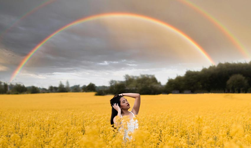
The Therapeutic Essence of Yellow in Colour Therapy
Yellow radiates a vibrant energy that symbolises joy, optimism, and enlightenment. Often associated with the sun’s warm glow, yellow is believed to stimulate mental processes, foster clarity of thought, and enhance communication skills. This uplifting hue is known to evoke feelings of happiness and freedom, encouraging a renewed sense of creativity and spontaneity. In addition, yellow can boost self-esteem and confidence, serving as a powerful antidote to feelings of depression and lethargy. Therapists frequently utilise yellow to help people break through mental barriers and ignite an inspired outlook on life. Its energetic wavelength is thought to stimulate the solar plexus chakra, which governs personal power and decision-making, further promoting a sense of empowerment and inner strength. Moreover, yellow is also linked to enhancing concentration and memory, making it an ideal colour for those seeking to improve their cognitive capabilities and mental agility. In a therapeutic setting, the presence of yellow, whether through décor, art, or light, can create an environment brimming with positivity and motivation. Thus, yellow stands as a beacon of hope and vitality in colour therapy, illuminating pathways to emotional wellness and holistic healing.

The Healing Power of Blue in Colour Therapy
Blue is celebrated as a powerful agent of tranquillity and healing, symbolising serenity, peace, and trust. Often associated with the sky and the sea, blue evokes a sense of vastness and depth, promoting feelings of relaxation and calmness that can alleviate anxiety and stress. This soothing hue is reputed to lower blood pressure and slow down heart rates, serving as a natural antidote to the frenetic pace of modern life. The cooling qualities of blue are also linked to alleviating pain and inflammation, making it a staple in therapeutic environments aimed at nurturing physical and emotional well-being. Beyond its calming effects, blue embodies communication and self-expression, encouraging open dialogue and honesty in interpersonal relationships. It is frequently used in spaces designed for reflection and introspection, as its inherent depth aids in fostering a connection to one’s true self. In essence, blue is a colour that invites us to pause, breathe, and reconnect with the inner peace and stability that lie within, serving as a gentle reminder of the harmony we can cultivate in our lives.
The Healing Essence of Orange in Colour Therapy
Being Dutch, I was curious about this one as it is The Netherland’s national colour. Orange, a vibrant and warm hue, holds a profound significance in colour therapy, where it is revered for its ability to invigorate the spirit and uplift emotional well-being. This playful and stimulating colour embodies a rich blend of the fiery energy of red and the joyful cheerfulness of yellow, symbolising enthusiasm, creativity, and balance. In colour therapy, orange is believed to foster a sense of social connection and community, encouraging communication and the expression of feelings. It is often associated with vitality and motivation, making it an excellent choice for those experiencing stagnation or emotional blockages. The energetic qualities of orange are said to stimulate appetite and promote physical health, aiding digestion and restoring vitality. Additionally, this lively hue is closely linked to the sacral chakra, the centre of creativity and emotional expression, allowing for the flow of creativity and personal insights. When utilised in therapeutic settings, orange can help people reconnect with their inner joy, reignite their passions, and embrace life with a renewed sense of adventure. Thus, the enduring symbolism of orange extends far beyond aesthetics, emerging as a beacon of warmth and healing.
The Significance of White in Colour Therapy
White embodies purity, clarity, and wholeness, serving as a powerful catalyst for emotional healing and spiritual awakening. As the amalgamation of all colours within the spectrum, white symbolises unity and balance, offering a blank slate that invites renewal and helps persons shed the burdens of past traumas or negative experiences. Its pristine nature is often associated with a sense of cleanliness and freshness, which facilitates mental clarity and promotes an atmosphere of calm and peace. White can enhance feelings of hope and inspiration, encouraging people to embrace new beginnings and explore their true selves without the hindrance of external influences. Practitioners of colour therapy utilise white to create environments that foster introspection and reflection, making it a vital tool for meditation and contemplation. Additionally, in healing practices, white light is often viewed as a protective energy that shields one from negativity while simultaneously promoting healing on physical and emotional levels. It invigorates the spirit, enhances self-awareness, and acts as a reminder of the inherent potential for growth and transformation that exists within us all, making it an essential colour in the enriching world of colour therapy.

The Significance of Black in Colour Therapy
Black is often perceived as a potent and complex colour that embodies a multitude of meanings and emotions. Unlike typical associations of black with negativity or mourning, colour therapists recognize black as a symbol of strength, protection, and potential. It is thought to provide a sense of grounding and stability, acting as a safeguard against external chaos and distractions. In therapeutic contexts, black can facilitate deep introspection and self-reflection, helping people confront and release repressed emotions and traumas. This transformative aspect is notable as black serves as a canvas upon which individuals can project their thoughts, allowing for mental clarity and the exploration of the subconscious. The depth of black also encourages adaptability and resilience, urging one to embrace change and foster personal resilience in difficult times. Furthermore, black can evoke feelings of sophistication and elegance, encouraging confidence and self-assuredness when navigating life’s challenges. In summary, black in colour therapy is more than just an absence of colour; it is a powerful symbol that encourages personal growth, emotional healing, and the reclamation of one’s inner strength.
The Therapeutic Essence of Pink in Colour Therapy
Pink is often associated with love, compassion, and nurturing energy, serving as a gentle reminder of the importance of emotional healing and self-acceptance. Its delicate hue is believed to evoke feelings of warmth and comfort, promoting a sense of inner peace that encourages the release of stress and tension. Pink stimulates feelings of calm and tranquillity, making it a powerful ally in the pursuit of emotional balance. It is particularly effective in soothing anxiety and cultivating a harmonious environment, allowing people to connect more deeply with their emotions and those of others. This vibrant yet soft colour is thought to inspire feelings of kindness and forgiveness, both towards oneself and others, fostering compassion that can lead to healthier relationships. In spaces infused with pink, one may find a sanctuary for healing, where the heart can open freely, unhindered by fears or insecurities. Additionally, pink is often linked to the idea of unconditional love, a colour that nurtures the soul, encourages vulnerability, and ultimately leads to personal growth. Embracing pink is akin to wrapping oneself in a warm embrace, offering solace and reassurance in times of emotional turmoil.
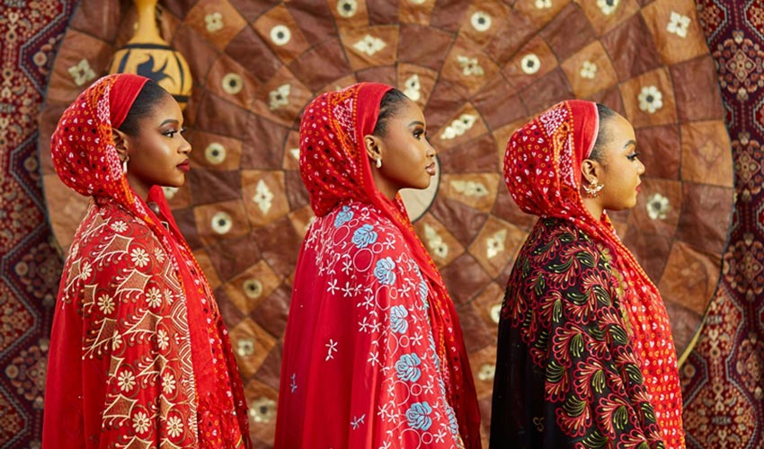
The Significance of Red in Colour Therapy
Red is a dynamic and potent hue that embodies vitality, passion, and energy, making it one of the most influential colours in therapeutic practices. Often associated with the root chakra, red is believed to ground people and connect them to their physical bodies and the earth, offering a sense of security and stability. This vibrant colour stimulates the circulatory system, enhances confidence, and ignites motivation, serving as a powerful catalyst for action and change. Red’s warm and invigorating nature can also evoke feelings of strength and assertiveness, encouraging self-expression and the pursuit of one’s goals. However, it is essential to approach the energy of red with mindfulness, as its intensity can lead to aggression or overwhelm if not balanced properly. In therapeutic settings, red is employed thoughtfully to awaken the spirit, boost mood, and inspire creativity, making it a valuable tool for those seeking to overcome lethargy or fear. By harnessing the transformative power of red, people can tap into their inner fire, enabling them to embrace their passions and navigate life with renewed enthusiasm and courage.
The Significance of Brown in Colour Therapy
The colour brown is often associated with stability, grounding, and a sense of security, serving as a nurturing presence that connects people to the earth and their own physical bodies. This warm, neutral hue embodies the essence of reliability and resilience, often evoking feelings of comfort and safety akin to returning home after a long journey. Brown is believed to promote emotional balance, aiding in the release of tension and anxieties, making it an excellent choice for those seeking to restore a sense of calm and clarity in their lives. Furthermore, its earthy qualities can encourage a greater appreciation for nature and the natural world, promoting mindfulness and a more profound sense of belonging within one’s surroundings. This colour is often seen as a representation of practicality and realism, urging people to be more grounded in their ambitions and aspirations while embracing their inherent worth without the trappings of societal expectation. In therapeutic settings, brown lends itself to fostering feelings of warmth and comfort, making it an ideal colour for personal spaces designed for reflection and rejuvenation, ultimately guiding people toward a deeper understanding of themselves and their connection to the world around them.
The Significance of Grey in Colour Therapy
Grey is often perceived as a subtle yet powerful hue that embodies a complex blend of neutrality and balance. As an intermediary shade, grey represents waning extremes, dissolving the stark contrasts of black and white. It evokes feelings of calmness and composure. This colour is associated with stability and reliability, encouraging introspection and clarity of thought. Grey can serve as a protective shield, creating a soothing environment that shields people from emotional turbulence, making it ideal for those seeking refuge from stress or chaos. However, it also carries the risk of emotional detachment if overused, leading to feelings of isolation or indecisiveness. In therapy, grey invites patients to embrace their feelings, fostering a space for reflection and contemplation without the distractions of more vibrant colours. Thus, grey becomes an essential tool for fostering emotional balance, encouraging grounding while prompting self-awareness, making it a significant choice in the journey of personal growth and healing.
The Significance of Silver in Colour Therapy
Silver is often associated with a unique blend of qualities that reflect harmony, balance, and intuition, making it a powerful hue in the healing process. Representing clarity and reflection, silver encourages patients to delve into their subconscious mind, promoting introspection and self-discovery. This metallic shade is believed to enhance communication and connection, both with oneself and with others, facilitating deeper interactions and understanding. Silver’s calming energy can alleviate feelings of anxiety and stress, offering a sense of peace and stability in turbulent times. It resonates with the idea of neutrality, serving as a bridge between the physical and spiritual realms, thus fostering enhanced intuition and psychic abilities. Furthermore, in the field of physical health, silver is often attributed with purifying properties, believed to help detoxify the body and boost the immune system. Its shimmering presence embodies the duality of strength and softness, encouraging adaptability, while its association with the moon aligns it with emotional healing and the cycles of life.
The Significance of Gold in Colour Therapy
Gold is often regarded as a symbol of illumination, wisdom, and prosperity. This precious hue is imbued with qualitative energy that transcends mere aesthetics, resonating deeply with human psychology and emotional health. Gold represents the divine light that inspires creativity and boosts self-confidence, acting as a catalyst for thoughts of abundance and success. When utilised in therapeutic settings, gold is believed to promote emotional healing and balance, encouraging people to let go of negativity while fostering a sense of optimism and vitality. The warmth of gold can evoke feelings of safety and comfort, making it a powerful ally for those seeking to break free from emotional restraints and cultivate inner strength. Moreover, its association with the sun imbues it with a sense of vitality and rejuvenation, sparking inspiration and motivation in those who are feeling weighed down by the challenges of life. Ultimately, in the spectrum of colour therapy, gold stands out not just as a shade of luxury but as a profound tool for transformation, illuminating the path to self-discovery and personal empowerment.
“Colors are vibrating light energies, each “color ray” produces a sound that affects matter.” – Jacqueline Ripstein